Faster Reporting From The Field

Scope of Work

Strategy
Web Design
Branding

Copyrighting
Naming
Forging a New Path
FieldFocus is a customizable SaaS solution for companies who require documentation from team members in the field. Originally called Safety Kick, the application served to manage safety compliance reporting for customers in the Oil & Gas industry located in Texas, Lousianna and Oklahoma.
Missing the mark
The founders of the company needed a new website that clearly defined the unique features and benefits of a completely customizable platform that allowed users in the field to send real time reporting from a mobile application to a base of operations in the office. Along the way, it was discovered that the name and brand did not fully convey the value of the brand.
A New direction
Safety Kick came to Divining Point with a request to rescue their website. The design was cluttered and difficult to read, and the homepage user experience resulted in a near 100% bounce rate. During preliminary discussions about the company’s site, we uncovered a bigger problem to the company: their brand was not consistent with the value of the application.
In order to tackle the rebrand, Divining Point started with an extended review of the operations of Safety Kick’s clients and the most commonly used features of the application.
The application’s core value for the user is the ability to gather real time data from multiple points and funnel them into a centralized database. However, it wasn’t just safety compliance reporting. Clients reported using it for a wide range of real time reporting that included entrance security, field equipment measurements, fuel usage, inventory reports and more. An aha moment occurred.
Since the application could be customized to fit any use case, Safety Kick was missing opportunities to grow their customer base by limiting themselves to safety reporting in the Oil & Gas industry.
Divining Point conducted a thorough analysis to understand the broader potential of the application for other industries – and the potential to tap into new revenue streams in the Service Industry, Security, and Fleet Management. Interviews and focus group sessions with managers from other target industries guided the process to develop a new direction for Safety Kick.
A focused look
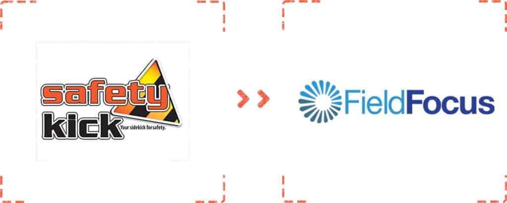
After intense brand sessions with the company stakeholders, a new identity emerged. From this identity a logo was developed which featured a cascading array of positions that pointed towards a centralized, virtual location in the cloud. The three-color brand design is equally corporate, new technology, and industrial. The typeface is legible and professional with an emphasis on “Focus” – the unique benefit awarded to the management teams that employed the FieldFocus application.
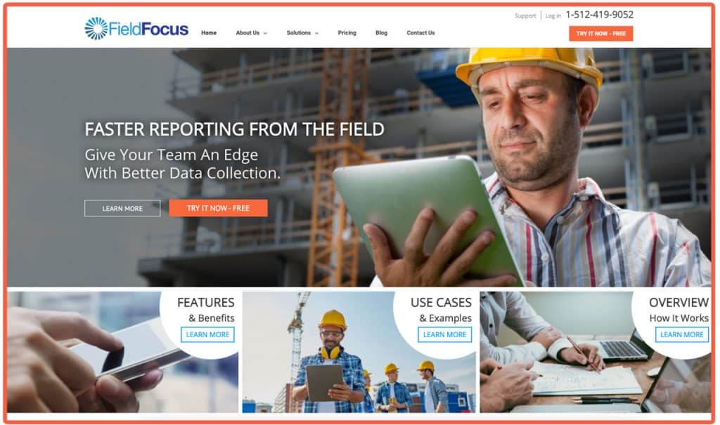
Following the renaming and rebranding, a new website was designed that matched the diverse market strategy. The colors and layout are a radical departure from the dark theme of the Safety Kick website, which used the orange and black colors consistent with safety and construction industries. The website redesign coincided with a complete overhaul of the application’s UI so that branding was consistent across all properties.
